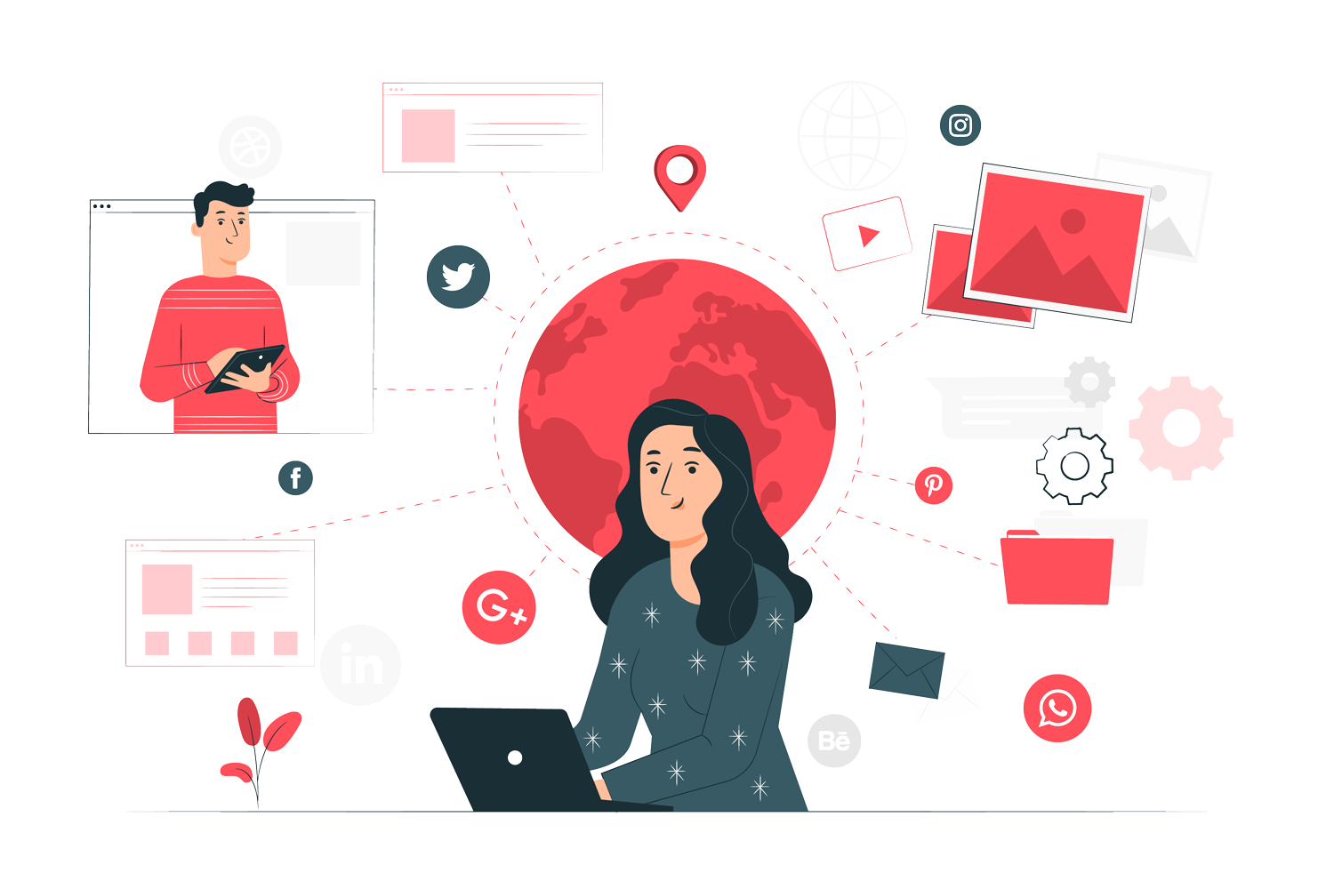
- Marketing
-
-
Marketing Services

-
-
- Development
-
-
Development Services

-
-
- UI/UX
-
-
UI/UX Services

-
-
- Resources
-
-
Our Resources

-
-
The most sought after search engine none other than Google which has grabbed the eyes of millions with its superb features and outstanding performances over the years. The word is just like a spell which has occupied a secure position on the home pages of every individual. Heated debate catches up every mouth when it is about the popular search engines. But honest reviews always voice for Google. Its charismatic logo has undoubtedly became an indispensable part of the online journey.
The skilled and promising founders of Google Mr Larry Page and Sergey Brin given their untiring effort to make the name standalone in the online market. Indeed their effort bloomed the flower of glory with its incredible numbers of followers. Since its inception on May 1999, the company founders has deliberately revised the logo to bring a fresh and new feel. Every time it has left a mark of remembrance among its users at the same time users have appreciated its eye catching cozy logo look.
For Google users the change definitely marks a new beginning, with an extremely innovative eye gluing look the luring world’s most popular search engine has astonished all. This time the look is more than amazing and outstanding. The colors depicting each of the letters embarks its presence among the heart of every users. Thus, The exasperated users are happy to see the revamped format of the logo.
Scrutinizing the change, users would see that this time the letter G would not restrict itself to the simple lower case rather it would go for the vibrant color and will be notified as Capital letter G. Indeed this eye gripping look will work the best on mobiles and smart phones. Maintaining the same colors like blue, green, red and yellow over the past seventeen years has definitely drawn a beautiful picture in the minds of the users. But the refreshed look has incorporated a bit twists in the color font although the colors remained the same as it was.
Definitely as the founders echoed that surely Google’s new design has given an edge over its past look. The new logo is more dynamic and adds the term splendid to it. Clicking on the Google icon will surely welcome to its new world which is known for its incessant performance on any kind of devices. Just use it like before and love it as always.

Know the Aspects to Develop Your Web Design Company
November 10, 2022

Let's connect to discuss your requirements!
Call Now: +91 9911013355
Request a Call Back